Bootstrap With Primeng Badge List Component


A badge list is common component on a website allowing to display a list of items, usually one word items. Those badges can be clickable which can then be used for filtering or even navigation. When a screen space is available, those badges can be simply displayed inlined but when screen space is reduced, mobile screens are a good example, having a list of badges can potentially take up 30% of the screen.
Today we will see how we can free up screen space, we need to move the badge list into a mobile friendly component in three steps:
Bootstrap Display Directive
In order to control the display of element depending on screen size, we use Bootstrap display directives.
It provides directive to control the display on particular screen size by using a combination of classes.
d-nonehides everythingd-blockto apply display blockd-inlineto apply display inline
Together with the breakpoint prefixes sm to xl.
Let’s see examples:
- display element from medium screen size onward:
d-none d-md-block - display element for screen size lower than medium:
d-block d-md-none - display only on medium screen size:
d-none d-md-block d-lg-none
PrimeNG Side Panel
PrimeNG is a open source component library for Angular which comes fully packaged with many controls.
Here we will see how we can use the side panel offered by PrimeNG.
We start first by installing PrimeNG:
1
2
npm install --save prime
npm install --save primeicon
Then we import the button module and the slide panel module in our application.
1
2
3
4
5
6
7
8
9
10
11
12
import { ButtonModule } from 'primeng/button';
import { SidebarModule } from 'primeng/sidebar';

@NgModule({
  imports: [
    ButtonModule,
    SidebarModule,
    ...
  ],
  ...
})
export class AppModule { }
Those PrimeNG modules import the button and side bar components which we’ll be using. We start first by placing a side bar on the page:
1
2
3
<p-sidebar [(visible)]="display" position="bottom" appendTo="body" styleClass="ui-sidebar-md">
    Content of the sidebar
</p-sidebar>
We define a databinding on display which we will use to control the display of the side bar. We also append the side bar to the body of the page with appendTo="body" instead of being inlined with the component. Lastly we also set the position as bottom so that the side bar slides from bottom to top and retract by sliding from top to bottom.
We can then use the button to show the side bar:
1
2
3
4
5
6
7
8
<button pButton type="button"
      label="Options"
      icon="pi pi-sort"
      iconPos="right"
      class="ui-button-secondary"
      (click)="display = true"
      [ngStyle]="{ 'width': '8em'}">
</button>
This button will set display to true which will show the side bar. To hide the side bar, the default behavior set by the component is to click out of the side bar.
Now that we know how to setup a side bar let’s see how we can use it to create a responsive badge list.
Responsive Badge List
We saw in 1) how we could use Bootstrap classes to show or hide component based on screen size.
Our responsive badge list will work as followed:
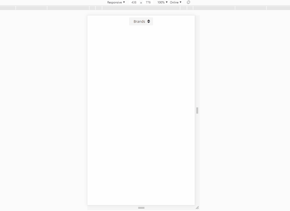
- on screen larger than small, it will show a badge list
- on screen smaller than medium, the badge list will display a single button
1
2
3
4
5
6
7
8
9
10
11
12
13
14
15
16
  <button pButton type="button"
        [label]="badge.name"
        class="ui-button-rounded mb-2 d-none d-md-inline"
        [ngClass]="{ 'mr-2': !last, 'ui-button-primary': badge.selected, 'ui-button-secondary': !badge.selected }"
        (click)="select(badge)"
        *ngFor="let badge of badges; last as last"></button>

  <div class="d-md-none text-center">
    <button pButton type="button"
      label="Brands"
      icon="pi pi-sort"
      iconPos="right"
      class="ui-button-secondary"
      (click)="display = true"
      [ngStyle]="{ 'width': '7em'}"></button>
  </div>
Now we can see that when the screen size is reduced, the list of buttons turns to a single button. We can then use this button to trigger the display of the side bar.
1
2
3
4
5
6
7
8
9
10
11
  <p-sidebar [(visible)]="display" position="bottom" appendTo="body" styleClass="ui-sidebar-md">
    <div>
      <h3 class="mb-3">Options</h3>
      <button pButton type="button"
        [label]="badge.name"
        class="ui-button-rounded mb-2"
        [ngClass]="{ 'mr-2': !last, 'ui-button-primary': badge.selected, 'ui-button-secondary': !badge.selected }"
        (click)="select(badge); display = false;"
        *ngFor="let badge of badges; last as last"></button>
    </div>
  </p-sidebar>
And here is the controller which can be used with the template.
1
2
3
4
5
6
7
8
9
10
11
12
13
14
15
16
17
18
19
20
21
22
23
24
25
26
27
28
29
30
31
import { Component } from '@angular/core';

@Component({
  templateUrl: './badge-list.component.html'
})
export class BadgeListComponent {
  badges: {
    name: string;
    selected: boolean;
  }[];

  constructor() {
    this.badges = [
      {
        name: 'Airbus',
        selected: false
      },
      ... // <== more data
      {
        name: 'Authentic',
        selected: false
      }
    ]
  }

  select(badge) {
    this.badges = this.badges.map(b =>
      Object.assign({}, b, { selected: b.name == badge.name ? true : false })
    );
  }
}
And here is the full HTML template:
1
2
3
4
5
6
7
8
9
10
11
12
13
14
15
16
17
18
19
20
21
22
23
24
25
26
27
28
29
30
31
32
<div class="container py-2">
  <div class="d-none d-md-block">
    <button pButton type="button"
      [label]="badge.name"
      class="ui-button-rounded mb-2"
      [ngClass]="{ 'mr-2': !last, 'ui-button-primary': badge.selected, 'ui-button-secondary': !badge.selected }"
      (click)="select(badge)"
      *ngFor="let badge of badges; last as last"></button>
  </div>

  <div class="d-md-none text-center">
    <button pButton type="button"
      label="Brands"
      icon="pi pi-sort"
      iconPos="right"
      class="ui-button-secondary"
      (click)="display = true"
      [ngStyle]="{ 'width': '7em'}"></button>
  </div>

  <p-sidebar [(visible)]="display" position="bottom" appendTo="body" styleClass="ui-sidebar-md">
    <div>
      <h3 class="mb-3">Brands</h3>
      <button pButton type="button"
        [label]="badge.name"
        class="ui-button-rounded mb-2"
        [ngClass]="{ 'mr-2': !last, 'ui-button-primary': badge.selected, 'ui-button-secondary': !badge.selected }"
        (click)="select(badge)"
        *ngFor="let badge of badges; last as last"></button>
    </div>
  </p-sidebar>
</div>
We now end up with a responsive badge list which turns to a side bar when screen size is reduced.
Conclusion
Today we saw how to create a responsive badge list by using a combination of Bootstrap display utility classes and PrimeNG button and side bar component. Hope you liked this post, see you on the next one!