Figma Auto Layout
Figma is a collaborative design tool that comes with a Free tier pricing for 3 projects and 2 editors. It comes with a full suite of features that allows us to create reusable designs and makes it easy to iterate on the designs. One of the features provided is the auto layout. In today’s post we will look into Figma auto layout feature and how it can be used to design components.
Auto Layout with Frame
Auto layout is an option available on frames. We start by creating a frame, and we can then apply an auto layout to it by clicking on the +.
Once the auto layout is added, we have a few options.
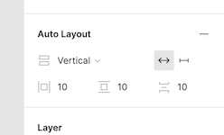
The first dropdown indicates the direction of the auto layout,
- Vertical
- Horizontal
Vertical layout will render the elements under the frame in a vertical positioning (y axis) while horizontal layout will render the elements in a horizontal positioning (x axis).
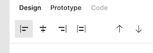
The buttons beside the dropdown indicates whether we want to have the width as auto or fixed. While the elements will be vertically positioned, the width of the frame can either take the max of the element (if set as auto-width) or a fixed amount.
Lastly the three numbers below are in order, the horizontal padding, vertical padding and padding between elements under the frame.
For example, selecting the previous settings with vertical, auto width, and 10 pixels paddings, we have the following:
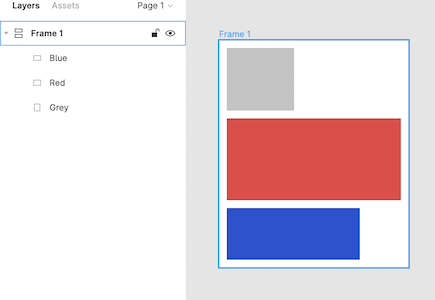
The positioning of the elements is dictated by their order in the menu, top to bottom under the frame will result in bottom to top on the designer. And the width of the frame is automatically set as the max of all width being the red rectangle.
Alignment
While using the auto layout, it’s also possible to make use of the alignments.
For example, with our previous vertical layout, we can make use of the alignment left/right/center to dictate the behavior of the frame when resized. This will act like constraints where elements aligned left will stick to the left and vice versa.
If we were using a horizontal layout, we would have the following alignment options:
Which would be an alignment top/bottom/center and will dictate the behavior of the frame when resized in term of height.
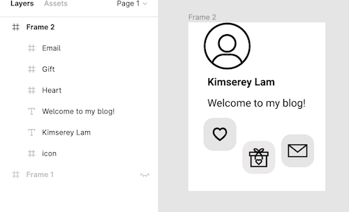
Card Component
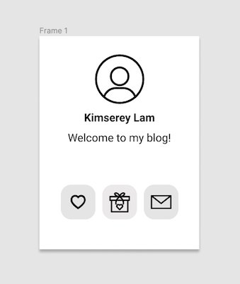
Now that we know how the auto layout works, we can apply it in an example of a card layout. We will be doing the following profile card:
We start by creating a frame and placing the elements in the frame:
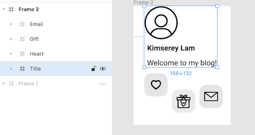
We can then make logical frames around the title containing the user image, the name and the description.
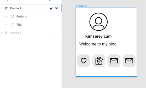
Then we can make another frame on the buttons.
Now that we have the frames, we can apply a vertical layout on the title frame to place the title elements in a vertical position while we apply a horizontal layout for the buttons frame to have the buttons aligned. And we then set the alignments of each elements in the title frame as Align Center and similarly for the buttons and make sure that each auto layout is set as auto width for vertical auto layout, and auto height for horizontal auto layout.
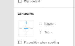
To complete the layout, we align Align Center the title and buttons frames themselves to center them in the center them in the main frame and set their constraints to top/center in order to fix their positioning to the center of the card.
Lastly we add a drop shadow effect on the main frame and we have our card!
Having the frames in auto layout setup in this way allows us to extend our design. For example if we where to change the text, we would see that the layout accomodates to the changes as the width is automatically set. And if we wanted to add a new button, all we would need to do is to drop a new button on the buttons frame and it would be placed properly automatically.
And that concludes today’s post!
Conclusion
Today we looked into the auto layout feature of Figma frames. We saw how the vertical and horizontal auto layouts behave and looked into each of the features available with it. We then looked at how alignments could be used with it and we completed the post by building a Profile card components using the features we discovered. I hope you liked it and I see you on the next one!